
CEO of Notio Konect, Marc Graveline – True story 🙂
Source: http://www.notiokonect.com/
My name is Marc Graveline. I’m a 54-year-old out-of-shape triathlete who has done all right in his age group in the past. As the Innovation lead for Notio Konect, I get to geek around quite a lot, and following one of the weekly TT series in Ottawa, I’ve decided to write about some of our findings. I’m hoping to demonstrate in a better way how our product will help others achieve their goals, be it completing a GranFondo, getting on a podium at Kona or simply improving their personal health.
In this article, I’ll be focusing on aerodynamic efficiency, which is best measured using the coefficient of aerodynamic drag (CDA). Several metrics will be addressed, but don’t be intimidated by all this “techy lingo”; many of the charts have been produced using our “power-user” version rather than the “simplified” app version of the product. I’ll do my best to vulgarize the technical aspects going forward.
THE COURSE
Our test run took place on a 15 km individual time trial course where we rode out 7.5 km and turned around back to the finish line. We rode mostly from west to east, and the end of the course went from north to south as you can see on the image below. Needless to say, the conditions were ideal for testing our aero sensor (used to measure airspeed, it is a critical component when it comes to calculating aerodynamic drag). There were E-N-E winds with gusts up to 32 km/h, so it was pretty windy.
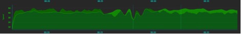
In the image below, you can see the whole course. The path gets higher as I ride along, and the highest point marks the end of it. The colours represent my travelling speed (green indicates the warm up, orange indicates the sequence where I’m ramping up around 36–42 km/h and finally, red indicates where I breeze through the path at more than 42 km/h. As you can see, we were experiencing a headwind going out and a tailwind coming back. The average speed was a 42.4 km/h throughout the full 15 km.
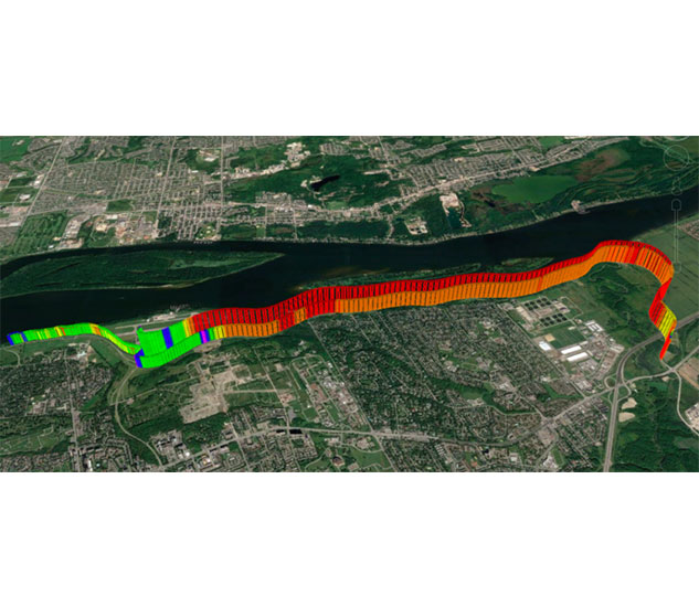
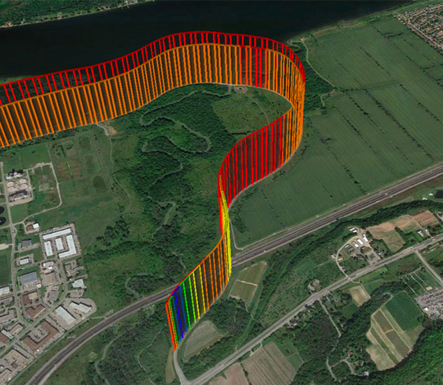
The ability to overlay data on real maps is extremely useful, since it allows you to see patterns you wouldn’t see from traditional charts. I often switch between the different views to focus on power, CDA and especially “watt loss” during various parts of the course in order to fully understand what caused them. I can really immerse myself into my performance and look at the power zone I was in, my heart rate or my cadence and know whether I was using slow-twitch vs fast-twitch muscles. The insights are really impressive.
THE EQUIPMENT, RIDER AND POSITION
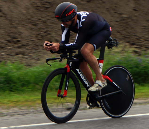
In order to have consistent results and to compare them after every ride, we’ve decided that I’d be the main rider for the tests. We wanted to make sure that our real-world results would match the wind tunnel results, and to do so, we had to keep the same conditions, which is why we used the same rider, bike, clothes, helmet and power meter. On the plus side, my schedule is always open when I want to run a new test.
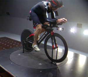
To broaden our range, we’ve tested the aerodynamic component of the system in the wind tunnel, in the indoor velodrome, in the outdoor velodrome and, of course, on the road. We’ve also tested it inside the A2 wind tunnel in North Carolina this past March.
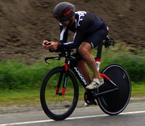
As part of our quest for consistency, we wanted to find a position that could be held over and over for as long as needed. I decided to use the position I held for Ironman Arizona in November of 2016. I can hold that position for hours. It’s not an aggressive one; in fact, it’s rather reasonable, as you can see in the pictures below, which were taken inside the wind tunnel and during this Thursday night’s TT in Ottawa.
THE “RACE PLAN”
We all know that a well-executed TT requires a good pacing plan and that this plan needs to fit the rider’s level of fitness. Well, in my case, the rider is an out-of-shape middle-aged man who doesn’t want to feel pain… I know what you’re thinking!
The plan was to try and pace myself while focusing solely on power and aiming for an average power of about 285 watts for the approximate time of 22 minutes needed to complete the 15 km. Last year, I had been able to finish this race with a time of 20:58 (42.94 km/h) on 294 watts, so I expected to finish it early during the 21st minute. Sure enough, my final results were the following: a time of 21:14 on 280 watts out and 286 watts back. Our product includes tools to plan a race and optimize it in accordance with your fitness levels and environmental conditions, which I didn’t use for this test.
THE RESULTS
While we usually talk about race time, what I wanted to showcase here is how accurate the sensor is. And to do so, we’ve focused on my coefficient of aerodynamic drag (CDA). The results shown in the image below are from an A2 wind tunnel test. Using the exact same configuration, I managed to maintain my CDA between .240 and .250 by playing with my head positioning. This shows how big a difference a subtle change can make. Wind tunnels are the gold standard for measuring CDA, but they are quite expensive and difficult to get to. And in the end, they are not necessarily a true reflection of an outdoor ride.
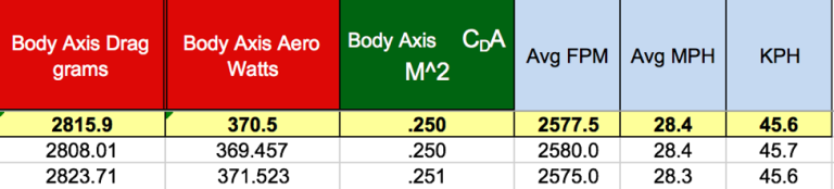
We then took the test outdoors to see how consistent we would be with the wind tunnel results. Needless to say, we’ve had great results despite the strong winds. My CDA was smooth throughout the whole race, which means I wasn’t bobbing around too much. That being said, I could definitely get a lower CDA. Below is the graph from our analysis tool showcasing my CDA over the 15 km TT. I averaged a .245 CDA going out and a .244 CDA coming back, the bump in the middle showing where I sat up to turn around.
Accurately measuring CDA in real time can have a huge impact on your time trial results. If you know your numbers, you can work on optimizing them during training and use them as a guide while racing. It’s not uncommon to find 10 minutes of aero, saving over a half IM.
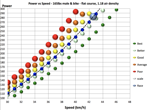
In the chart below, you can see how diverse profiles of power, red being the less aerodynamic person and green being the most optimized rider. I currently trend along the blue line, which gives me critical insights on how to manage my performance. I can see that I need to get my power up a few watts, my CDA down a few decimals and speed will automatically improve. A sub .25 CDA in an Ironman position for an old fat guy is good, I will go lower, shrink the belly and adjust my position and maybe get .235ish. Unfortunately they don’t make faster bikes ☺.
Keep in mind that a good CDA isn’t the same for a 6’3” 200 lbs man and a 5’2” 112 lbs woman.
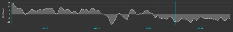
THE WIND
In this graph, the darker green above the lighter line shows the headwind, while the lighter green below shows the tailwind. As a result of the headwind going out, you can see that I was a bit slower on similar watts when I came back. We display the wind speed on your head unit to help you with your pacing. Many people put in a few more watts to counter the wind, and road racers can use the wind display to make adjustments to their position.
In the graph below, you can see the wind by itself, with gusts of up to 15 km/h and a tailwind at one point.
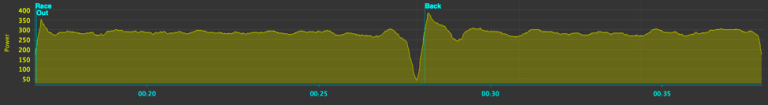
To further illustrate how a rider can choose to power through the wind, my power graph below shows that I could’ve used more power while going out to counter the headwind. 280 watts out and 287 watts back are pretty even results, but I could’ve added power during the first half to reverse those numbers. Based on my HR and other metrics, I would probably set a target of 5 to 7 more watts while going out.
FITNESS
Below is an interesting graph that predicts when you will blow up and run out of gas.
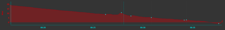
Using your threshold power (CP) and what is known as your anaerobic capacity (W’), this chart shows that when you go over your threshold, you start running out of W’. And when you hit 0, you’re out of gas. This feature is very interesting when used during high-intensity interval training.
The graph explains actual W’ depletion quite well, but you can also create planned models to optimize race plans. You can see that I dipped below 0 without blowing up towards the end, which indicates that my threshold power is actually higher than what I had set up for myself. This also tells me that I can work a little harder! The spike in the middle represents, I’m sure you guessed it, the moment when I slowed down to turn around, which resulted in a small recovery period.
This tool can be quite useful to:
- measure true fitness
- plan a better race.
- plan a series of hard/easy efforts to maximize time at a given pace and recovery
You can see these numbers in real time. That being said, the counter going down and telling you that you’re about to be out of gas can cause anxiety and affect your motivation. We are looking into adding a wizard in the software to set objectives and perhaps a counter for the beers you earn as you hit your targets. 😉 Cheers!
On a personal note, there is a detection mechanism for potential gains in fitness, and it went off during my race. Thanks to this graph and a few other metrics, I’m confident that I can increase my threshold a bit and that it will affect the power I use during my training. Gains!
WHAT’S NEXT
These tests are our new benchmark, and going forward, we’ll be able to see how small position changes can impact our power usage, the goal being squeezing out watts. I’ll also replicate the same position on a different bike for fun.
Next time, we’ll also run the pacing optimization tool and follow it, as well as analyze the reports we’ve gathered and see if we need to apply tweaks to my performance. Keeping my head low and going faster and faster: that’s my goal. It’s great to have the chance to improve my personal training plan while doing all this testing.
We’ll make sure to write about the other sensors in the tools to help you get a better understanding of Notion Konect’s upcoming developments .